What changed this week
This week is less about adding one isolated screen and more about making the learner loop easier to use in sequence.
The app now reads more clearly as a daily IELTS coach: open the app, understand the mission, move into a drill, and send weak answers to Review without losing the thread.
One note on the comparison format: last week’s public release did not yet show dedicated public proof for every one of these surfaces. Where that happened, the then image below uses the closest truthful public screenshot from that build.
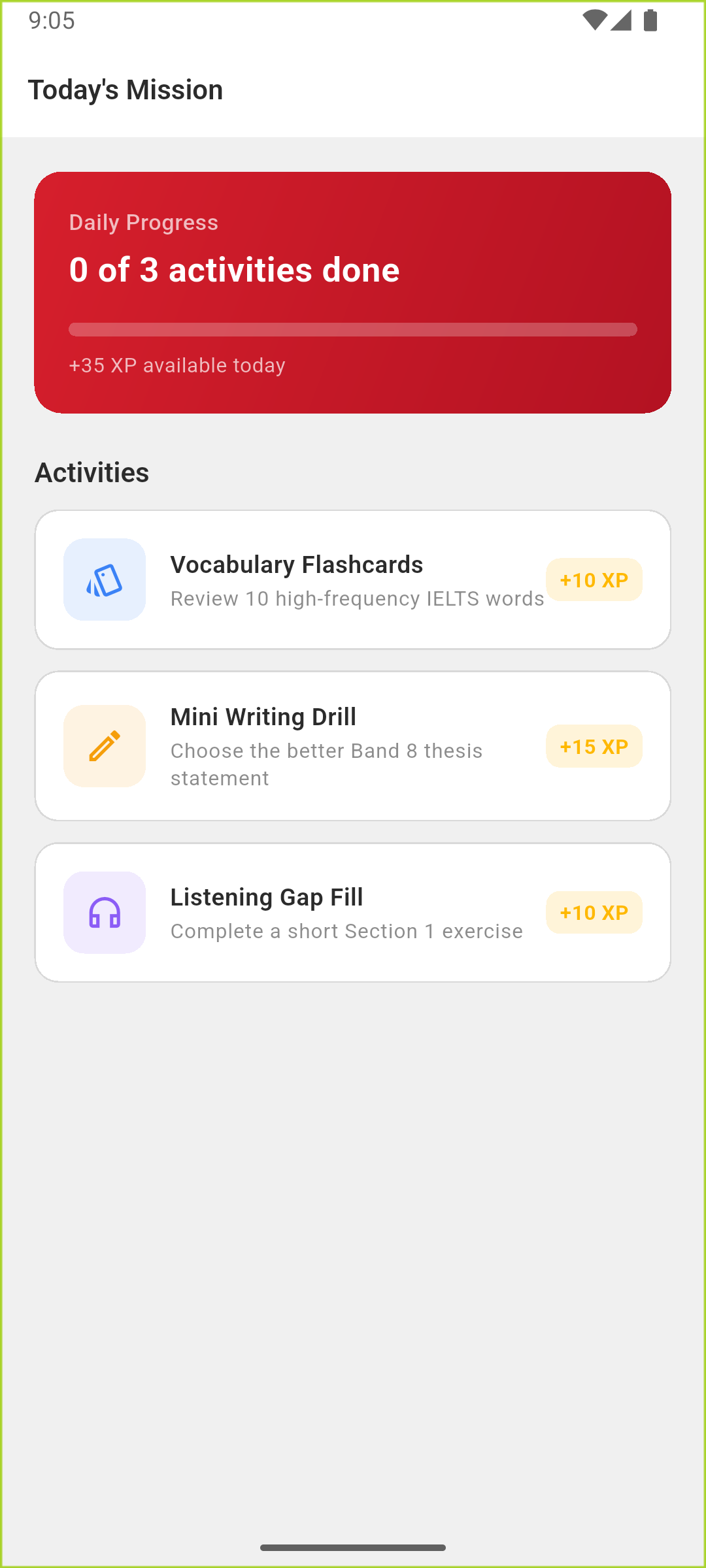
Home / Daily Mission
Then
The public proof was mostly about showing the mission direction.
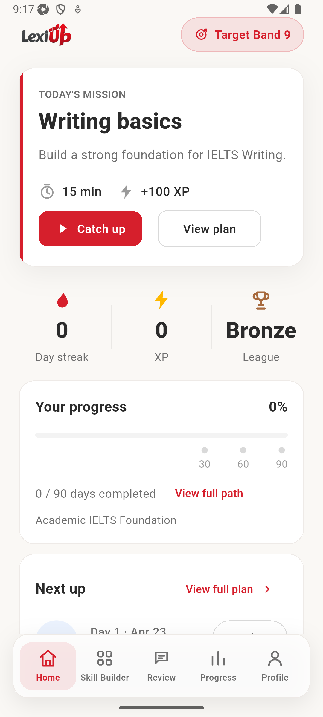
The current home screen makes the routine easier to understand at a glance: the mission is still central, but progress, next up, and the wider study path now feel more connected.
Why it matters
IELTS learners do not need another abstract dashboard. They need to know what to do today, how much ground is already covered, and what comes next if they still have time to study. This update pushes Home further in that direction.
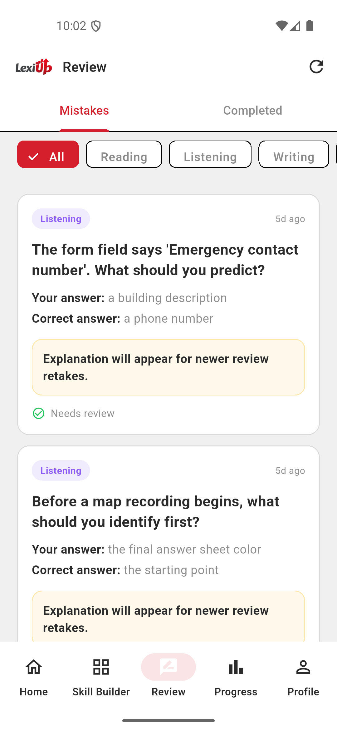
Review
Then
Review already saved mistakes, but the recovery path was still simpler.
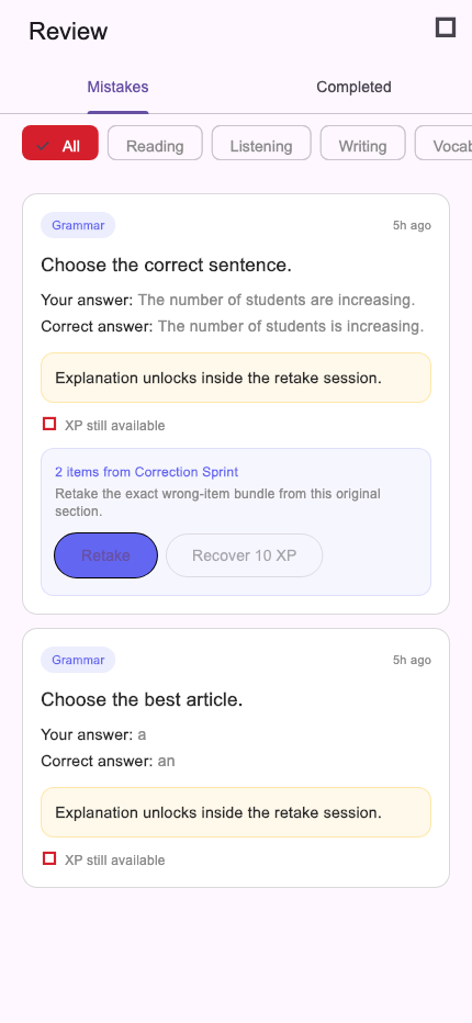
The newer Review flow is more actionable. It still surfaces the mistake, but now it also shows retake bundles, explanation unlocks, and the XP a learner can recover by finishing the correction cleanly.
Why it matters
Recovery work matters in IELTS prep. If wrong answers disappear after a drill or a lesson, learners end up repeating effort without revisiting the exact weak spots that slowed them down. A richer Review screen makes that part of the routine easier to trust and act on.
Skill Builder
Then
The hub showed which skills existed, but not yet the deeper drill library.
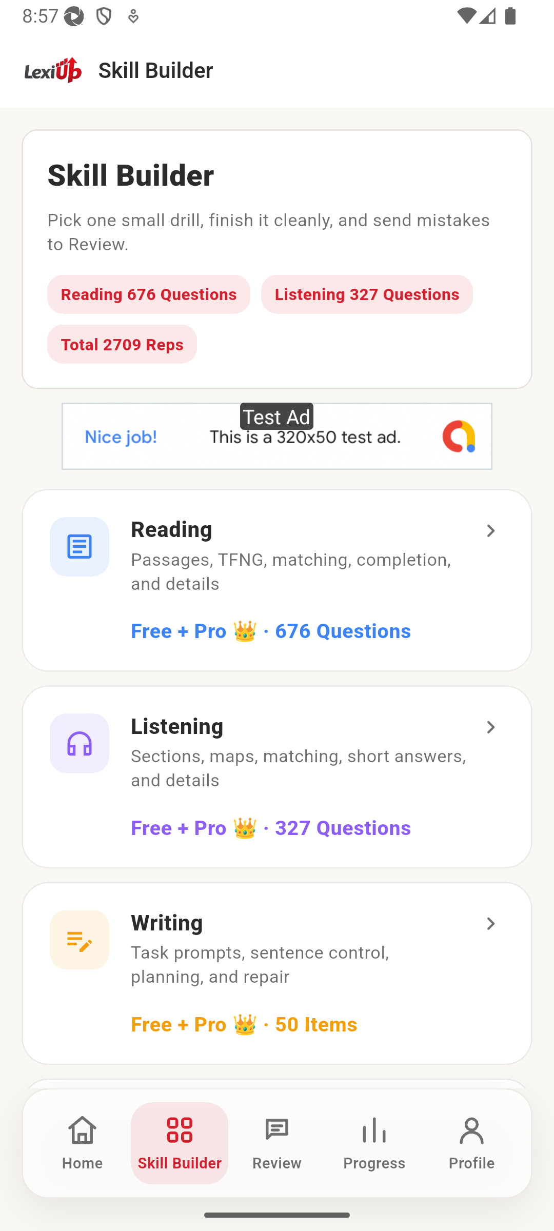
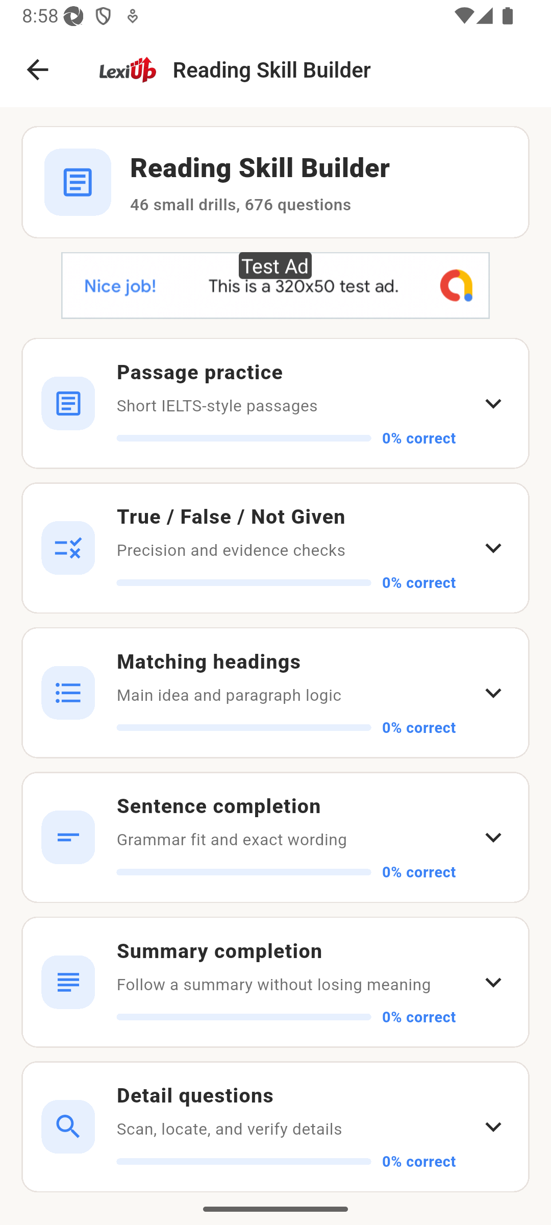
The newer proof goes deeper than the hub. Once a learner opens Reading Skill Builder, they can see the real drill groups waiting inside, not just the fact that Reading exists.
Why it matters
This matters for the learner who only has ten or fifteen minutes. Instead of stopping at a top-level category list, they can move straight into the part of the skill library that matches the kind of question they want to practise.
Under the hood, in learner terms
- Home now reads more like a daily coach surface, not just a mission card.
- Review now supports a clearer retake path instead of only storing the mistake.
- Skill Builder proof now reaches into the drill library, not just the top-level hub.
- The public build story is getting closer to how the app is actually used from session to session.
What’s next
The next step is to keep tightening the same loop rather than jumping to a different story: cleaner session flow, stronger drill surfaces, and more confidence that learners can move from plan to practice to review without friction.