For: IELTS Academic learners who can describe individual figures but need a reliable way to select and summarise the most important features before writing detailed comparisons
Build an IELTS Writing Task 1 overview from the big picture
An IELTS Writing Task 1 overview gives the reader the big picture before the detailed figures arrive. In Academic Task 1, you may need to describe a graph, chart, table, process, map, plan, or another visual. The overview should select the most important trends, differences, similarities, or stages.
It should not become a list of every number you can see.
Official IELTS information says that Academic Task 1 requires at least 150 words and recommends about 20 minutes. The response must be connected prose, not notes or bullet points. It also tests whether you can give a well-organised overview of the visual information.
That makes selection important: you need enough detail to support the report, but the overview itself needs to show the structure of the whole visual.
This guide uses one original library-visits chart and a five-step method. The example is not an IELTS question and does not reproduce protected test material. Its purpose is to make the selection process visible. You will move from raw values to two main features, write one concise overview, and then decide which figures belong in the body paragraphs.
Start with one original chart and one clear overview
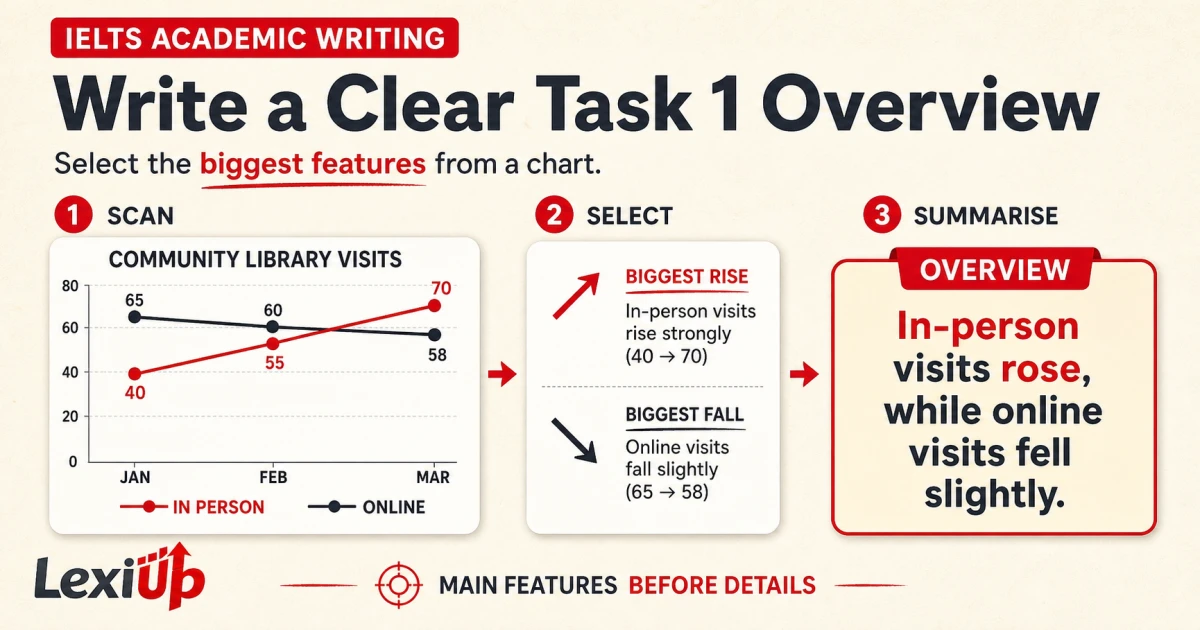
Imagine a line chart called “Community library visits”. It compares two ways of visiting a library across January, February, and March. In-person visits rise from 40 to 55 and then 70. Online visits start at 65, move to 60, and finish at 58.
The values are invented for this lesson, so you can focus on the reasoning rather than outside knowledge.
The strongest overview is: “Overall, in-person visits rose, while online visits fell slightly.” This sentence captures the two opposite directions across the complete period. It does not repeat the chart title, list all six values, or explain a cause that the visual does not provide. It gives the reader a reliable map for the details that will follow.
The chart contains other true observations. Online visits were higher in January. The two lines moved close together in February. In-person visits were higher in March. These points can support later paragraphs, but they are not all equally important in the overview.
The overall rise and slight fall organise the full visual, while the individual positions and values illustrate those movements.
| Observation | Role in the response | Reason |
|---|---|---|
| In-person visits rose from 40 to 70 | Main overview feature | It is the largest change across the whole period |
| Online visits fell from 65 to 58 | Main overview feature | It gives the contrasting overall direction |
| The lines were close in February | Supporting detail | It describes one point rather than the complete period |
| In-person visits reached 70 in March | Supporting figure | It provides evidence for the rising trend |
| The reason for the change | Do not include | The chart supplies no cause or explanation |
Step 1: read the task before reading the numbers
Begin with the instruction and the chart frame. Identify what the visual shows, which categories are compared, the unit of measurement, the place if one is given, and the time period. For a process, identify the start and end points. For maps or plans, identify the two locations or time states being compared.
This prevents you from writing a correct sentence about the wrong relationship.
Do not calculate or copy values yet. First decide what type of visual you are reading. A line graph often invites movement over time. A static bar chart or table may require highest, lowest, and group comparisons. A process needs the main stages and whether it is linear or cyclical.
A pair of maps needs the most important additions, removals, relocations, and unchanged areas.
Write a private frame note before drafting: “two visit types, three months” or “town centre, before and after”. This note is not part of the answer. It simply protects the scope. If your later overview ignores one category, one visual, or one time state, return to the frame and rebuild the sentence.
- Confirm the visual type and the exact task instruction.
- Identify categories, units, places, and time periods.
- Check whether one or several visuals must be summarised.
- Notice whether the information shows movement, comparison, stages, or spatial change.
- Keep opinion and outside explanations out of the report.
Step 2: scan for the largest and clearest features
Scan the whole visual before following one line or column in detail. Ask which feature changes most, which category stays highest or lowest, which groups move together, and where a clear contrast appears. For the library chart, the largest movement is the rise in in-person visits.
The clearest contrast is that online visits move slightly in the opposite direction.
Use visual distance as a first clue, then check the values. A steep line, long bar, large gap, repeated stage, or major map change may be important. However, the picture can mislead if the axis does not begin at zero or if categories use different units. Confirm each selected feature against the labels before you write it.
Aim for two or three main features, not a fixed number for every task. A simple chart may need two. A pair of visuals may need a relationship that covers both. A process may need the beginning, the end, and two or three grouped phases.
Selection is successful when the reader can understand the overall shape without receiving every detail.
- Look across the complete visual once.
- Circle the largest movement or difference.
- Mark a second feature that contrasts with or completes the first.
- Check both features against the labels and scale.
- Confirm that every visual or major category is represented.
Step 3: separate overview features from supporting details
Test each observation with one question: does it describe the whole visual or only one point? “In-person visits rose” covers the complete period. “In-person visits were 55 in February” covers one value. The first belongs in the overview; the second can support a body paragraph. This distinction keeps the overview concise without making the response vague.
Exact figures are usually more useful in the detail paragraphs. British Council and IDP preparation guidance both distinguish the big picture from supporting data. You can state the main movement generally in the overview, then use accurate values and comparisons to prove it later. This also prevents the opening of the report from becoming crowded with numbers.
Do not remove meaningful limits. “Online visits fell” is accurate, but “fell slightly” is more precise because the change is small. Likewise, avoid dramatic words such as collapsed, soared, or transformed unless the scale genuinely supports them. A careful overview preserves direction and degree without adding causes, opinions, predictions, or a score claim.
| Better for the overview | Better for a body paragraph |
|---|---|
| In-person visits rose steadily | They increased from 40 in January to 70 in March |
| Online visits fell slightly | They moved from 65 to 60 and then 58 |
| The two categories changed in opposite directions | In-person visits passed online visits by March |
| The process has three broad phases | The heating stage begins after the material is mixed |
| The centre became more pedestrian-focused | The eastern car park was replaced by a public square |
Step 4: write one or two sentences that cover the whole visual
Write the overview after you select the features, even if you place it near the beginning of the final response. One or two sentences are often enough. Signal the paragraph clearly with “Overall” or another natural phrase, then state the main features directly. A signal helps the reader, but it cannot replace accurate selection.
For the original chart, write: “Overall, in-person visits rose across the period, while online visits declined slightly. By March, in-person visits had become the more common method.” The first sentence gives both trends. The second adds the important final comparison. If the second sentence repeats a later detail without improving the big picture, leave it for the body.
Use grammar that matches the visual. Past data normally needs past forms. A process without a time reference often uses the present simple and passive forms. Future plans may need future or planned-change language. Maps comparing the past and present need clear time markers. Accuracy is more valuable than forcing several complex structures into a short paragraph.
- Begin with a clear overview signal when it helps navigation.
- State two or three selected features in a logical relationship.
- Preserve direction, degree, and time reference.
- Avoid unsupported reasons, opinions, and predictions.
- Keep exact evidence available for the body paragraphs.
Step 5: test the overview against three questions
Before moving to the body, test the paragraph. First, does it cover the complete visual? Second, does it identify the most important features rather than isolated details? Third, does every statement come directly from the visual? If any answer is no, revise the selection before adding more sentences.
Then cover the chart and read only the overview. Can you sketch the basic shape from those words? For the library example, you should expect one clear rise and one small fall. If the overview only says that visits “changed”, it is too general. If you can reconstruct every value, it probably contains too much detail.
Finally, compare the overview with the planned body paragraphs. Each main feature should receive evidence later. You might group the two January starting values in one comparison, then describe how the lines moved and ended. The overview and body should work together: the overview gives the route, and the body supplies accurate figures and comparisons along that route.
- Check that all major visuals or categories are covered.
- Remove figures that do not help the big picture.
- Replace vague change words with accurate direction and degree.
- Delete any cause or opinion not shown by the visual.
- Match every overview feature with supporting evidence in the body.
Adapt the five steps to charts, processes, and maps
For a data chart, scan for overall movement, highest and lowest categories, stable groups, major gaps, and unusual exceptions. Select the features that organise the visual, then support them with figures. Do not turn the overview into a catalogue of peaks and lows when one broader relationship explains them.
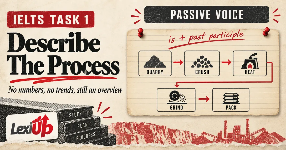
For a process, identify the start, finish, total number of broad stages if clear, and any cycle or repeated input. Group small actions into meaningful phases. For maps and plans, compare the main purpose or organisation of the area, then select the largest additions, removals, or changes in use.
Mention an unchanged feature only if it helps define the overall transformation.
For two related visuals, do not write two separate mini-overviews unless the task truly requires it. Look for the relationship between them: a shared trend, an opposite pattern, a dominant category, or a change that one visual helps explain. The overview should represent the full task, not stop after the first chart because it looked easier.
| Visual type | Useful overview features | Common detail trap |
|---|---|---|
| Line graph | Overall directions and major crossings | Listing every time point |
| Bar chart or table | Highest, lowest, clusters, and major gaps | Reporting each category separately |
| Process | Start, finish, broad phases, and cycle | Describing every arrow in the overview |
| Maps or plans | Main change in purpose or organisation | Listing every new object |
| Combined visuals | The relationship that covers both | Summarising only the first visual |
Practise selection before you practise speed
Use a short practice loop. Spend one minute scanning an original or authorised visual and write only two feature notes. Then draft one overview without figures. Compare it with the visual and label each sentence “main feature”, “supporting detail”, or “unsupported”. This makes the selection error easier to see than writing a full report every time.
On the next attempt, use a different visual type. A learner who can summarise a line graph may still overdescribe a process or map. Rotate tasks and keep one error label: missed category, too many figures, vague trend, incorrect degree, unsupported cause, or incomplete second visual. Let the most frequent label choose the next session.
Add time pressure only after the decision routine is stable. The goal is not to memorise one overview sentence. It is to recognise the structure of new information and express it accurately. Use current official practice sources for authentic task formats, and keep original home-made charts for focused selection drills between full practice tasks.
Connect overview practice to LexiUp IELTS
LexiUp IELTS can help you keep Writing practice, feedback, and mistake review connected on iPhone. Use the daily plan to choose one clear task, practise a focused skill, and return to saved mistakes instead of starting another unrelated resource. The app is free to start and supports independent IELTS preparation.
For this lesson, use a narrow target such as “select two main features before writing figures”. After practice, record whether the overview missed a category, used too much detail, or added an unsupported explanation. A precise review note gives the next session a clear purpose without treating one response as an official band score.
LexiUp is independent and is not affiliated with or endorsed by IELTS. Use official IELTS, British Council, IDP, and Cambridge materials for current test information and authentic practice. Use LexiUp to organise the surrounding study loop: practise, request guidance when useful, review the reason, and return with a clearer selection method.
Frequently asked questions
What is an IELTS Writing Task 1 overview?
It is a concise summary of the most important trends, differences, similarities, stages, or changes in the Academic Task 1 visual. It gives the big picture before detailed evidence.
Should I include numbers in the overview?
Usually, exact figures are clearer in the body paragraphs. Use the overview to state the main patterns, then support those patterns with accurate figures and comparisons.
Where should the overview appear?
It often follows the introduction because that gives the reader an early map of the report. The essential point is that the overview is clear and covers the complete visual.
How many main features should I select?
There is no fixed number for every visual. Two or three well-selected features are often enough, provided they represent the complete task and not only one category or one detail.
Does General Training Writing Task 1 need the same overview?
No. General Training Task 1 is a letter, while the graph, chart, process, and map overview belongs to Academic Writing Task 1. Follow the format for the test you are taking.
Sources and review note
This guide was reviewed against the sources below. LexiUp remains independent of the exam owners.