For: IELTS Academic learners who can read a grouped bar chart but describe it bar by bar along the axis, and who want a repeatable way to turn the same chart into real comparisons, one overview, and two supported body paragraphs
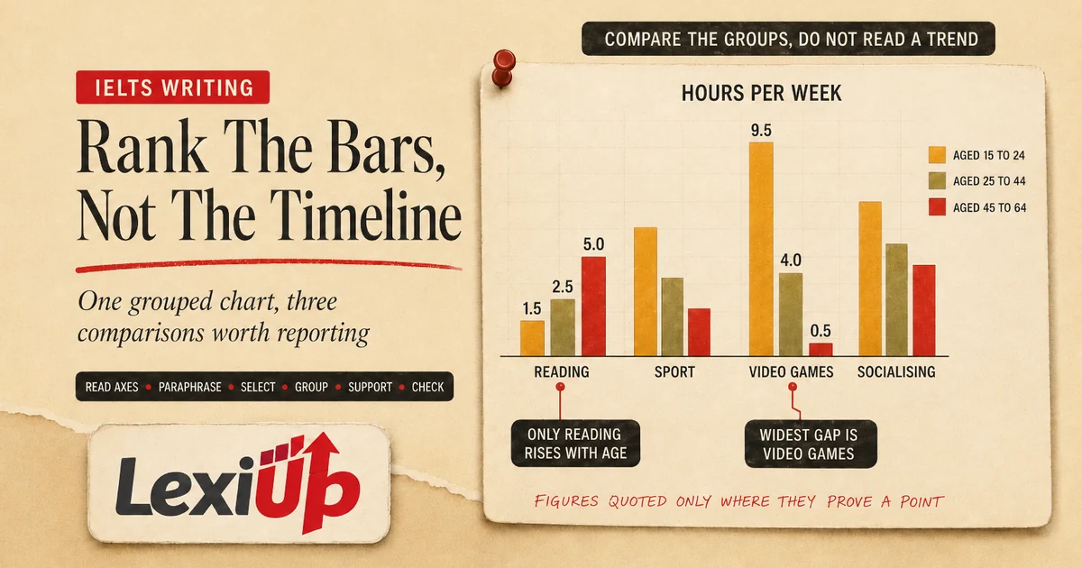
An IELTS Writing Task 1 bar chart asks you to compare, not to list
An IELTS Writing Task 1 bar chart puts values side by side so that they can be compared. Each bar carries one category, the height or length of the bar carries the measured quantity, and a grouped chart adds a second dimension by placing several bars inside every group.
Academic Task 1 asks you to summarise the information by selecting and reporting the main features, and to make comparisons where relevant. On a chart built entirely for comparison, that final clause is not an optional extra. It is the task itself.
The failure mode here is not the one a line graph produces. A line graph tempts you into listing values in time order. A bar chart tempts you into walking along the axis and reporting each bar in turn, which produces a paragraph that is accurate, complete and says almost nothing.
The reader finishes it knowing every number and no relationship, and relationships are exactly what the assessment criteria reward.
This guide gives six practical steps and one original worked chart. The countries, the activities and every figure below were written as teaching material for this article. They are not real test questions and they are not official answers.
Use the official IELTS, British Council, IDP and Cambridge pages listed at the end for current format and assessment information.
See one original chart become an overview and two body paragraphs
Here is the original teaching chart for this article. It is a grouped bar chart showing the percentage of adults in three imaginary countries, Alta, Berun and Corva, who took part in four leisure activities during a single year. The four activities are team sport, hiking, gardening and playing a musical instrument.
There is no time axis anywhere on it, so nothing in this chart rises or falls. Every sentence you write about it will be a comparison.
Read the chart in both directions before writing a word. Across the four activities, gardening reaches the highest single value on the chart, 62 per cent in Corva.
Down inside each country group, the leading activity is different every time: team sport in Alta at 42 per cent, hiking in Berun at 47 per cent, gardening in Corva at 62 per cent. Playing an instrument sits lowest in all three countries and barely moves at all, from 11 to 14 per cent.
Two sentences of overview carry all of that. Overall, each of the three countries had a different most popular leisure activity, while playing a musical instrument was the least popular in all three and varied hardly at all between them. No figures belong in those two sentences, and none are needed there.
The numbers belong in the body, where each comparison is proved by two or three chosen values rather than by all twelve.
| Activity | Alta | Berun | Corva |
|---|---|---|---|
| Team sport | 42 | 18 | 26 |
| Hiking | 15 | 47 | 31 |
| Gardening | 28 | 35 | 62 |
| Playing an instrument | 11 | 12 | 14 |
The same chart, written two ways
Two reports can quote identical figures from this chart, run to a similar length, and still be assessed very differently. The difference is not accuracy. It is whether the reader is handed a comparison or left to work one out alone. Both extracts below are original teaching material written for this article.
Report A reads: in Alta, 42 per cent took part in team sport, 15 per cent went hiking, 28 per cent gardened and 11 per cent played an instrument. In Berun, 18 per cent took part in team sport, 47 per cent went hiking, 35 per cent gardened and 12 per cent played an instrument.
In Corva, the four figures were 26, 31, 62 and 14 per cent.
Report B reads: overall, each country had a different most popular activity, while playing an instrument was the least popular in all three. Gardening was far more common in Corva, at 62 per cent, than in Alta, at 28 per cent.
Hiking showed the widest spread of any activity, from 15 per cent in Alta to 47 per cent in Berun.
Every number in Report A is correct, and Report A is the longer of the two. What it never does is compare. The published Task 1 criteria ask for a clear overview of the main features and for comparisons where relevant, and Report A offers neither, while Report B offers both in fewer words.
Selecting is not a shortcut taken to save time. It is a large part of what is being assessed.
| What the report does | Report A | Report B |
|---|---|---|
| Quotes accurate figures | Yes | Yes |
| States an overall feature | No | Yes, in the first sentence |
| Compares between the countries | No | Yes, twice |
| Selects rather than lists | No, all twelve values | Yes, four values |
| Length | The longer of the two | The shorter of the two |
Step 1: decide first whether the chart carries time
Bar charts come in two kinds and they take completely different language. If the horizontal axis carries years, the chart behaves like a line graph drawn as columns, and trend language belongs in it: rose, fell, remained stable. If the axis carries categories, places or groups, nothing changes over time and trend language is simply inaccurate.
Writing that gardening increased in Corva would be wrong on the worked chart, because there is no earlier value for it to have increased from.
Check the axis before you write the first sentence, and note which kind you have. The worked chart is the category kind, so its language stays comparative throughout: higher than, twice as many as, the most popular, the least common.
Learners who have prepared only trend vocabulary reach for it here out of habit and produce confident sentences that nothing on the page can support.
A third case is worth knowing. Some charts carry both, with categories grouped along the axis and each group holding two bars for two different years. Those take both kinds of language: trend inside each pair, comparison between the groups. Naming the kind of chart first is what tells you which sentences are even available to you.
| The axis carries | What can change | Language that is accurate |
|---|---|---|
| Years or dates | Values over time | Rose, fell, peaked, remained stable |
| Categories or places | Nothing over time | Higher than, the most common, twice as many |
| Categories, two bars each | Both | Trend inside a pair, comparison between pairs |
Step 2: read across the groups and down inside them
A grouped IELTS Writing Task 1 bar chart holds two readings, and most weak reports use only one. Reading across compares the same category between groups: how gardening compares in Alta, Berun and Corva. Reading down compares categories inside one group: which of the four activities leads in Berun.
The chart is a small table drawn as rectangles, and a table is always read both ways.
Do both readings on paper before writing. Across the categories, one activity is the clear ceiling of the chart and one is the clear floor. Down inside the groups, the interesting fact on the worked chart is that no two countries share a leading activity, which is a genuine finding rather than a number.
Findings of that kind are what an overview is made of.
Notice which reading produces the shorter, stronger sentence. Playing an instrument was the least popular activity in all three countries covers three of the twelve values in one clause. That compression is not a stylistic flourish.
It is the difference between selecting and reporting, which is what the task asks for, and listing, which is what it does not.
- Read across each category and note its highest and lowest group.
- Read down each group and note its leading and trailing category.
- Circle any value that is the highest or lowest on the whole chart.
- Look for a pattern that holds in every group, and for one that breaks.
Step 3: choose the two or three comparisons for the overview
The overview is a selection and not a summary of everything. Two or three comparisons are enough for almost any chart of this kind. Look for the largest single value, the smallest, any category that behaves the same way in every group, and any group that behaves differently from the rest.
Those four questions will find the main features of most category charts in about a minute.
On the worked chart, two statements do the work: every country has a different leading activity, and playing an instrument is lowest everywhere with almost no spread. Everything else on the chart is detail that supports one of those two. Making the choice before writing turns the body paragraphs into something close to mechanical.
Signal the overview clearly with overall or in general, and put it either directly after the introduction or at the very end.
Directly after the introduction is the safer habit under time pressure, because a report that runs out of time still contains the feature the examiner is looking for instead of losing it with the final paragraph that never got written.
| Candidate feature | Keep or cut | Why |
|---|---|---|
| Each country leads on a different activity | Keep | A pattern across the whole chart |
| Playing an instrument is lowest in all three | Keep | Holds in every group, and the narrowest spread |
| Gardening reaches 62 per cent in Corva | Cut from overview | The best supporting figure for feature one |
| Hiking is only 15 per cent in Alta | Cut from overview | Detail belonging to a body paragraph |
| Team sport in Berun is 18 per cent | Cut | Neither a main feature nor needed support |
Step 4: give each body paragraph one comparison to carry
Body paragraphs work when each one carries a single comparison rather than a single group. A paragraph per country reproduces the chart in prose and forces the reader to do the comparing. A paragraph per finding does the comparing for them, which is the whole service the report is meant to provide.
For the worked chart, the first body paragraph can take the three leading activities together, because they belong to one finding: Alta leads on team sport, Berun on hiking, Corva on gardening. The second can take the activity that behaves the same everywhere, playing an instrument, and add the widest gap on the chart as a contrast.
Two paragraphs, two findings, and no bar reported twice.
Grouping this way also protects your connectors. When two values genuinely contrast, whereas and while are accurate. When several behave alike, similarly and likewise are accurate. Deciding the grouping first means the connector describes something real, instead of being dropped in to make a sentence sound more academic than its content.
- Write the finding as a sentence before writing the paragraph.
- Put every value that proves that finding into the same paragraph.
- Give the second finding its own paragraph.
- Choose the connector after the grouping, never before it.
Steps 5 and 6: prove each comparison, then check how you compared
Each comparison needs evidence, and two or three figures usually supply it. Gardening was far more common in Corva, at 62 per cent, than in Alta, at 28 per cent, proves the gap completely. Adding the Berun figure to the same sentence adds length without adding meaning, because Berun sits between the two and settles nothing.
Quote the values that decide the claim and stop.
Attach the unit and the group to every number. A bare figure is ambiguous on a grouped chart, where the same height can belong to four different bars, and an unattached number is the most common accuracy slip on this task.
Vary how the data arrives as well: inside the verb phrase, in a bracketed aside, or in a short separate sentence. The same structure five times reads as a template even when every value is right.
Then check the grammar of comparison on its own pass. More than and fewer than take plural countable nouns, less than takes uncountable ones, and twice as many as needs the second half of the comparison actually present. Look at the comparative forms once, the units once, the group names once, and the 150-word minimum once.
Four narrow passes catch more real errors than a single broad reread.
- Quote the two values that decide the comparison, not all of them.
- Attach the unit and the group name to every figure you use.
- Use approximately for a bar that sits between gridlines.
- Check that every comparative has both of its halves present.
- Confirm the report clears 150 words before you stop writing.
Practise IELTS Writing Task 1 bar chart reports in a weekly routine
Short repeated practice beats one long session. On day one, write overviews only, three of them, with no figures at all. On day two, take one chart and write the same finding as three different sentences. On day three, practise attaching data three different ways. On day four, write one complete report in twenty minutes.
On day five, review that report against a single target rather than rescoring the whole thing.
Review with evidence rather than impression. Mark one sentence where a figure arrived without its group, one where a comparative was left half finished, and one where a bar was reported that proved nothing. Fix that one target in the next attempt.
A session that produces a single observable change is worth more than a session that produces a general feeling about your writing.
LexiUp IELTS is built to keep that loop short. It is free to start and has been entirely ad-free since version 1.0.10, and its AI feedback reads a Writing attempt criterion by criterion, so a report that compares poorly can be separated from one that merely has grammar slips.
The free tier returns five successful AI feedback results in any rolling twenty-four hours. Its band guidance is an estimate meant to aim your practice, not an official IELTS examiner score.
- Turn repeated slips into a shorter checklist with IELTS mistake review →
- Schedule these sessions inside a daily IELTS study plan →
| Day | Practice focus | Finish with |
|---|---|---|
| 1 | Overviews only | Three overview sentences, no figures |
| 2 | One finding, three sentences | The same comparison written three ways |
| 3 | Attaching data | One comparison supported three different ways |
| 4 | Full report | One report written in twenty minutes |
| 5 | Evidence review | One error note and one focused retry |
Frequently asked questions
Can I use trend language on an IELTS Writing Task 1 bar chart?
Only when the horizontal axis carries time. If the axis carries categories, places or groups, nothing on the chart changes over time, so rose and fell describe something that is not there. Use comparative language instead: higher than, the most common, roughly twice as many as.
Do I need an overview if the chart has only one set of bars?
Yes. A single set still has a highest bar, a lowest bar, and a shape to its ranking. Summarise which category leads, which trails, and whether the values are close together or widely spread, then support that with a small number of figures in the body.
Should I describe every bar on the chart?
No. Selecting is part of the task, and a grouped chart with three groups of four bars holds twelve values that will not fit a 150-word report anyway. Report the main comparisons, then quote the values that prove them. A complete list usually scores lower than a well-selected report of the same length.
How do I compare three groups without repeating myself?
Group by finding rather than by country. If two groups behave alike, put them in one clause and contrast the third. If all three differ, one sentence naming each leader is shorter and clearer than three separate sentences, and it shows the comparison the criteria ask for.
What if two bars look almost the same height?
Say so. Roughly the same, almost identical, and marginally higher are accurate and useful, and they are safer than inventing a precise difference the chart does not give you. Use approximately for any bar that sits between gridlines.
Sources and review note
This guide was reviewed against the sources below. LexiUp remains independent of the exam owners.